Friday, 8 December 2017

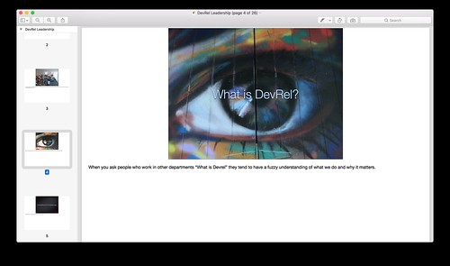
Why are the presenter notes ugly when I export them as PDFs from Keynote?

I use Keynote and I like it. However like many other professional-grade products from Apple it seems to to be changing in ways that make it less suited to my needs.
Ugly PDF export from Keynote 7.3.1
In Keynote 09 I can easily export a good looking PDF with presenter notes and upload it to Speakerdeck or Slideshare.

In Keynote 7.3.1 that's no longer possible. All you can do is export a PDF with presenter notes that take up more than 50% of the page. Or you can export something decent-looking but it won't have presenter notes.

There's an OpenRadar issue for it but it's been open since July 2015 and it still hasn't been fixed.

That leaves people like me with a limited set of options.
  1. Stop using Keynote.
  2. Go back to using Keynote 09.
  3. Use Keynote 7.3.1 then export to Keynote 09 format and from Keynote 09 export a PDF.
  4. Export a PDF without speaker notes and hope that people will wait for the video of your presentation to be available.
  5. Adopt Monica Dinculescu's approach where you change your slides after the presentation so that your speaker notes are part of each slide.

Wednesday, 14 June 2017

Progressive web sites: a future that’s native to the web

People sometimes claim that the web and native apps are converging. I disagree. I think the process is more like chiasmus in the sense that we will end up with an app-like web and a web-like app ecosystem but they'll still be different from each other. The two ecosystems will cross over but the results will have surprising new capabilities and unlock new metaphors for thinking about them.

In the meantime we are stuck in an uncanny valley where a lot of the PWAs people know are designed like Android apps rather than trying to be native to the web. One of my colleagues even wrote an article arguing that you should "start by forgetting everything you know about conventional web design, and instead imagine you’re actually designing a native app."

I think we can do better but first we have to imagine a future for the web that isn't just about building native apps in Javascript. This requires a conceptual model that’s native to the web.

That conceptual model would assume that people aren't going to arrive at your home page. Instead they'll find your site through search or social which deeplink to a specific page and they won't know if your site is valuable yet. That means they won't be immediately interested in adding your site to their home screen or giving you access to device capabilities (like notifications or location) or waiting whilst a massive Javascript bundle downloads.

That conceptual model would focus on the uniquely universal reach of the web rather than just what's possible on high-end mobile devices. That's because the first time the user visits your site may be on a desktop and if they get a bad experience they're not going to click on links to your site when they turn up in search results or in a social media context. Even if the first visit happens on a mobile device it may be a low end device or on a flakey network so if they get a bad experience there they definitely won't return in other contexts.
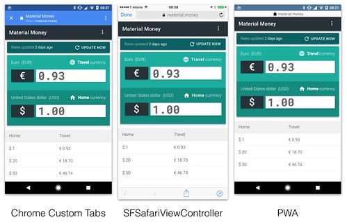
That conceptual model would emphasise URLs, linking to other people's sites and reusing rather than reinventing browser features. For example native apps get Chrome Custom Tabs or SFSafariViewController which are great experiences that encourage linking to the rest of the web. Consequently their developers don’t have to worry about harming retention metrics because it's just one click to get back. But we don't yet have the equivalent for PWAs.
Different contexts for viewing web pages
So, what do we call this new model? I think Jeremy Keith was right when he coined the phrase Progressive Web Sites because I believe that the best thing about PWAs is that they are part of the web. The trick is that they need to be good websites. This means that a good PWS should:
  • use the PRPL pattern to ensure the fastest possible initial experience.
  • take advantage of PWA techniques and technologies to give the user the best possible experience.
  • be responsive so that any user on any device can access the site and get a good experience.
  • be progressively enhanced because the set of capabilities that will be available on the user's device are unknowable.
  • link liberally and rely on the browser to provide features like sharing, window management and navigation.
  • default to web-like design tropes and only make the effort to be app-like when it provides a clear benefit.
  • focus on their own branding (whilst still being responsive to the constraints of the user's context) rather than trying to fit into any given operating system's guidelines.
In conclusion I think that most people should be building web-like websites rather than app-like websites. That's because few sites are compelling enough that people will benefit from having instant access via their home screen. If you're Twitter.com then a PWA is the right choice because millions of people want your icon on their homescreen, will launch it every day and want to use device capabilities (like the camera or notifications). However if you're Oshineye.com then a PWS makes much more sense because even I don't want it on my homescreen. Don't think of this as a binary choice. Instead it's a spectrum and you should choose your place on it based on:
  • the nature of your traffic. If you depend on traffic from external links, have high bounce rates and low session-depth then you should be leaning towards PWS. If you have lots of direct traffic, low bounce rates and high session-depth then you should be leaning towards a PWA. 
  • the amount of resources you're willing to invest. The less resource-constrained you are the more you should skew towards a PWA.
  • the incremental ROI: If your incremental ROI is small then it doesn't make sense to invest a lot. Given that a PWA is a bigger investment than a PWS you should default to PWS and only make the extra investment to build a PWA if you can clearly articulate the additional benefits you'll get from it.

Tuesday, 30 May 2017

PWAs are websites

"We are all just prisoners here of our own device"
I recently saw this article in SD Times by Frank J. Ohlhorst which was describing the PWA approach to a new audience. Whilst I'm glad that Frank wrote the article I felt it had a few significant technical inaccuracies or misunderstandings.

It initially starts strong with lots of elements taken from Alex Russell's original blog post. The author then correctly points out that Alex's post didn't tell people about the app shell model or explain service workers. Then he makes a few errors.

Firstly PWAs don't work like websites, they are websites.

As a result they don't require frameworks. Here's the code to a PWA: https://github.com/GoogleChrome/gulliver that was built without using a framework. And this is Huffduffer. It's one of my favourite PWAs. It also doesn't use any frameworks. That doesn't mean I think frameworks are bad. Just that whilst frameworks and libraries can help with building great web experiences (like my favourite interface to Hacker News) they're not essential.

Another misunderstanding is the claim that PWAs can't support single-sign-on and cross-application logins because "PWAs are unable to independently collect and store that login information." This is incorrect. PWAs like Google+ already support single-sign-on. Try visiting it in an incognito window, signing-in then visiting another Google property. You'll stay signed in. This is possible because PWAs are just websites.

Another misunderstanding is the idea that PWAs lack hardware support. PWAs are only limited to the hardware features that browsers can access on each platform. Since browsers are just native apps like any other the true constraints are in the APIs they choose to expose to web sites. That means cameras are supported and so is GPS and so are biometrics. You can try the latter in Stripe's Apple Pay demo.

There are certainly caveats that should be applied. For instance many of the web APIs for hardware aren't standardised or aren't available in all mainstream modern browsers or aren't as good as the equivalent native APIs. Many of them also don't iterate as fast as the equivalent native APIs. At the same large numbers of people use these capabilities every day in web apps like Facebook, Instagram and Google Maps.

Finally there's a misunderstanding of Safari's support for PWAs. It's true that Safari currently doesn't support Service Workers or web app manifests or push notifications but that misses the point of PWAs. The P stands for progressive as in progressive enhancement. That means that a good PWA will still be a good experience on Safari but will be progressively enhanced to be a better experience on browsers that have more features.

I'm biased since my team at Google built it but I think that a great resource for looking at hundreds of examples of PWAs is our PWA Directory. I would also suggest that people take a look at our PWA Checklist and my colleague Owen Campbell-Moore's Google I/O 2017 talk to get some tips on how to build a great PWA.


Tuesday, 25 October 2016

Starting a new PWA directory


A few of us in Google's Developer Relations group are building a little demo: pwa-directory.appspot.com It's open source and code named Gulliver because it's a PWA directory in the spirit of Yahoo or DMOZ.
That means it's not a curated gallery. Instead we recommend that people who just want to see a set of exemplary PWAs should go to the pwa.rocks PWA directory.
If there's already another PWA directory why are we doing this and what do we hope to achieve?
Our primary goal is to learn in the open and share those lessons. Some of the things we hope to learn include:
  • what makes people use a PWA offline?
  • what constitutes a meaningful offline experience?
  • what percentage of our userbase actually uses it offline?
  • which PWA technologies help with acquisition, engagement, retention and re-engagement of users?
  • how do we build a good cross-platform and cross-browser experience?
  • what signals in analytics and Search Console indicate that we are on the right path?
  • what are the things we believe or assume that are wrong?
We hope to get 1000 30DAU of this content-centric (lots of pages with URLs) PWA over the next few months. That level of regular usage should start to surface some of the challenges that big web apps face.
However this isn't a big web app so our stack is relatively simple.
The one clever technical feature is that we use Lighthouse As A Service. That means that every time someone submits a manifest (all we require is that the site provide a web manifest over HTTPS) we run Lighthouse inside a headless Chromium instance to collect metrics about the quality of the prospective PWA. If you’re already a Lighthouse user then you may spot that our scores sometimes differ from those you see in Lighthouse. It’s an open issue and we’re working on it.
Lighthouse is a big part of this web app’s value so it's going to be the subject of the first in a series of articles sharing the lessons we are learning in building Gulliver. Until then you can get in touch with us via Github if you have questions or feature requests.


Tuesday, 2 August 2016

Embeds, content and context

As a publisher you have 2 choices. You can either bring the people to your content or you can find ways for your content to flow towards the people. Historically that has meant using syndication technologies like RSS but in these days of #PeakRSS that's no longer sufficient. The audience are no longer just sitting in front of their aggregators. They're sitting in front of activity streams watching reshares and hitting reload on their favourite websites every morning.

To maximise the reach of your content you have to reduce the accidental friction (see Brooks on the difference between essential and accidental properties) involved in sharing to those activity streams. That means making it easy to share (hence the sharing buttons all over the web), making it clear why they should share (hence the various experiments encouraging you to share or tweet specific quotes from an article) and finally making the shareable unit something that can travel easily around the web.

This is where embeds come in. An embed is a card that contains a chunk of a site's functionality that can be ripped out of that site and reused elsewhere.

http://parochialaesthetics.tumblr.com/post/148169494570/eliel-saarinen-always-design-things-by-context
This can range from music players (like Soundcloud) to video players (like YouTube) to quotes (like Twitter) to whole discussion threads (like Google+). What distinguishes them from glorified screenshots or Xanadu's transclusions is their interactivity. Visitors to your site can interact with this foreign content without abandoning your site.

But isn't this what links are supposed to do? Unfortunately inline links have various problems:
  • they take the user away from your site
  • they break silently
  • the content at the destination has to be consumed without the context provided by your site
  • the destination can't provide guarantees about the experience your audience will receive and thus you can't set reliably expectations for anyone who clicks on the link
Embeds don't have these problems. They:
  • keep the user on your site
  • break in ways that are immediately visible
  • are consumed in the context provided by your site
  • can be constrained to a tiny card with a predictable UX within your site 
Embeds also represent a chance for publishers to change social media from something where your campaigns/integrations send traffic to someone else's site to something that delivers measurable value (traffic and revenue) to you. The most valuable embeds:
  • convert your social efforts into traffic on your site 
  • help you keep people engaged with your site
  • help you increase the reach of your content
  • help you use other people's content to enrich your site
Ultimately publishers will realise that embeds are just the first generation of portable content unit and they have their own limits. There will be other generations and they can offer different trade-offs.

Wednesday, 20 July 2016

Art, AI and Google I/O 2016

What if there are interesting things waiting to be discovered where artificial intelligence meets art?

At Google I/O 2016 Ramzi Rizk told me there's a field called Computational Aesthetics. It is so nascent that it doesn't even have a Wikipedia page. Computational Aesthetics is where computers can actually tell us if a picture is pretty or not. This is different from systems like Flickr's Interestingness because the system infers beauty from the image itself rather than from the social signals generated by people's interactions with the image. In fact there's already been research showing that social signals lead communities like Flickr to overlook hidden gems. This research raises the tantalising possibility that there may be large numbers of overlooked masterpieces hiding in the historical corpus of art.

I find this intersection of art and machine learning interesting because at scale it leads to the discovery of new tools and new perspectives on something that we consider to be uniquely human. For example the spatial visualisation used in the "Machine learning & art" talk at I/O lead me to t-SNE as a mechanism for building two-dimensional maps of high-dimensional spaces.

This raises the possibility of building pirate maps of information spaces or hypertexts and connecting that to Vannevar Bush's ideas about stigmergy in the Memex. Imagine being able to create and share your own trail through the space of all art? Or being able to reinvent the idea of the traditional slideshow of the family's holiday photos.


Today apps like Prisma merely help us make alternative versions of existing photos. At the same time apps like The Roll and Google Photos help us identify our best photos. In the future they might help photographers to create photos from scratch and tell new kinds of hypertextual stories.

A photo posted by Ade Oshineye (@ade_oshineye) on

Wednesday, 29 June 2016

Cargo cults and progressive web app stores

Every city needs a curator
People are seeing that native app platforms have some feature and are then asking for the exact same feature for the web. Instead they should be asking about the job to be done and the benefits users or developers see from a given feature. For example app stores :
  • give an obvious place to find apps that have particular functionality (try searching for "games that don't need wifi" in the Play Store). 
  • give developers an obvious place to find large numbers of users. 
  • give developers a structured mechanism for exposing the features of their app so that users can filter the set of available apps for apps that have those features. 
  • give users an obvious place to review apps. 
  • give developers an obvious place to accrue reputation for their apps. 
  • give platform vendors a place to assert policies that drive developer behaviour.
  • give every app on a platform a canonical URL ( for example here are iOS and Android URLs for the same game).
It's easy to forget that app stores emerged as a response to the difficulties of dealing with carriers to get your content 'on deck'getting your apps preinstalled and the extremely closed nature of that ecosystem. However that's not the job to be done on today's web. Instead what we need is:
  • a plurality of voices and projects pushing the web forwards. 
  • a mechanism where submitting a PWA is as easy as providing a URL therefore anyone can do it.
  • a mechanism where web sites and web apps don't have to provide anything proprietary in order to have a chance of being featured.
  • to build upon the lessons learned from Mozilla's Firefox Marketplace and Chrome's Web Store.
  • something that feels like it's part of the hypertextual web of links rather than a poor copy of native app stores.
Instead of 'cargo culting' the app stores we should be asking what web-centric solutions to the problem would look like. For me that means lots of competing and opinionated PWA directories rather than one central PWA Store or even a popular search engine.